
How To Design a Slipcover with Buffalo Check
Learn how to work with buffalo check fabric as you pin fit and sew your slipcover. Use these tips to ensure the best look, feel, and function for your custom-made cover.
Determine the Pattern Layout
Look closely at a buffalo check fabric and you might see there is a more dominate, darker stripe to the pattern. This is more common on woven checks than it is on printed versions.
Think about which way you want to position the darker stripe on your slipcover. Do you want it to appear vertical on your chair or sofa? Or, do you want it to run horizontal? The pattern orientation will dictate how much yardage you will need.
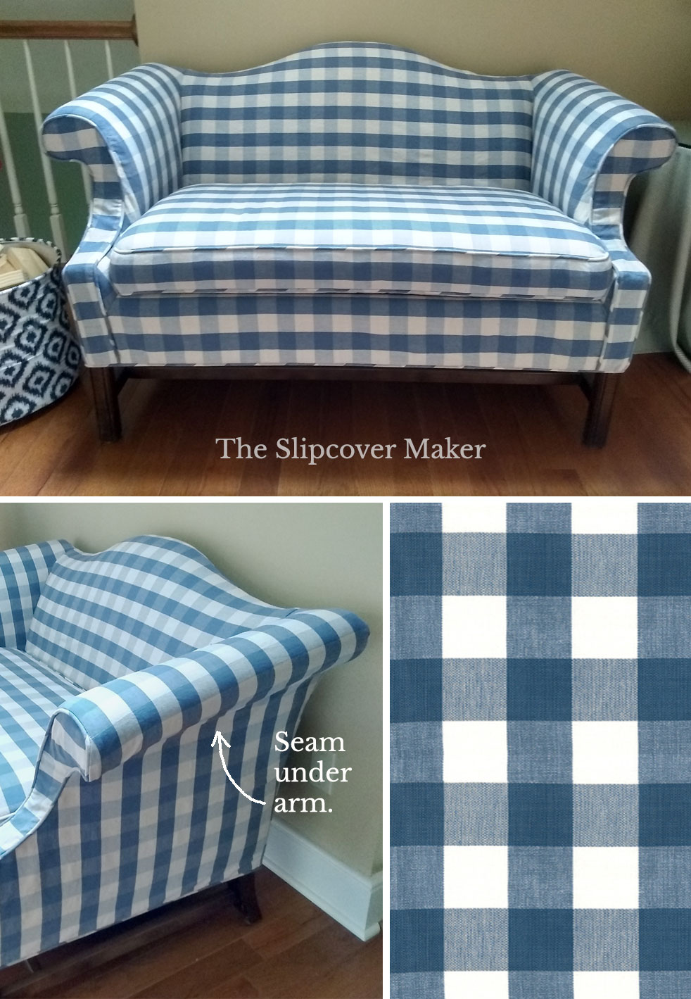
For this settee, my customer chose a horizontal layout. I railroaded the fabric, which allowed me to place the darker stripe across the widest width of the furniture without having to piece it. Designing the pattern layout with as few seams as possible is always best when working with a check.
As I ran the stripe over the arm, it fell vertically on the outer sides of the settee. I did that on purpose to keep the horizontal layout continuous from left to right.
Fabric: Lyme Buffalo Check French Blue by Roth & Tompkins.
Take a look at the before photo for this makeover. It’s quite a transformation!
Match the Check Pattern
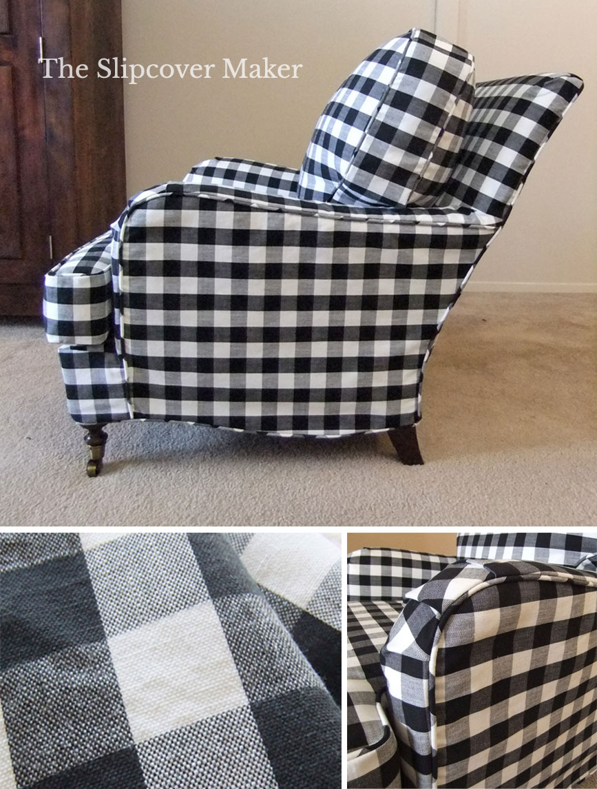
A buffalo check is a high contrast pattern. When it’s matched up on all seams, it’s easy on the eyes and gives the slipcover a high-end look.
A buffalo check is easy to match on boxy-style pieces and classic rolled arm designs.
I always make the seat and back cushions first, before I pin fit the furniture. I center the check pattern on the cushion pieces and boxing panel. From there, I match all other sections of the slipcover to the cushions.
Sometimes it’s not possible to match the pattern in every single area, especially if your slipcover design has pleats, tucks and lots of curved seams.
Matching also can be challenging if the check layout is not square. For example, the repeat size might measure 3 inches on the vertical and 3 1/4 inches on the horizontal. That small 1/4 inch difference will throw off the pattern match in a big way.
Fabric: Barston Naples Shade polyester blend.
Opt for a Yarn Dyed Pattern
You will get more bang for your buck when you choose a yarn dyed buffalo check. The pattern is woven, not printed, which gives the fabric rich color and some surface interest. The quality of a yarn dye has a more authentic look than a print. It typically wears better, too.
Yarn dyed buffalo checks often come in color combinations and textures you won’t find in a print.
Keep in mind not all yarn dyed buffalo checks are ideal for slipcovers. Stay away from loose weaves and weights under 8 oz. Those are best used for draperies and upholstery.
Some woven buffalo check fabrics in 100% synthetic fiber or blends might not wash and dry very well. Be sure to sample and test before you commit to yardage.
Choose the Best Size
Buffalo checks are offered in many repeat sizes ranging from approximately 2 to 6-inch square. I consider anything smaller than 1 inch a gingham check.
Think about which size of buffalo check will work best for your chair or sofa proportions.
Will the check size repeat enough times across the furniture to make the pattern look balanced? Does the size suit the style of slipcover you’re making?
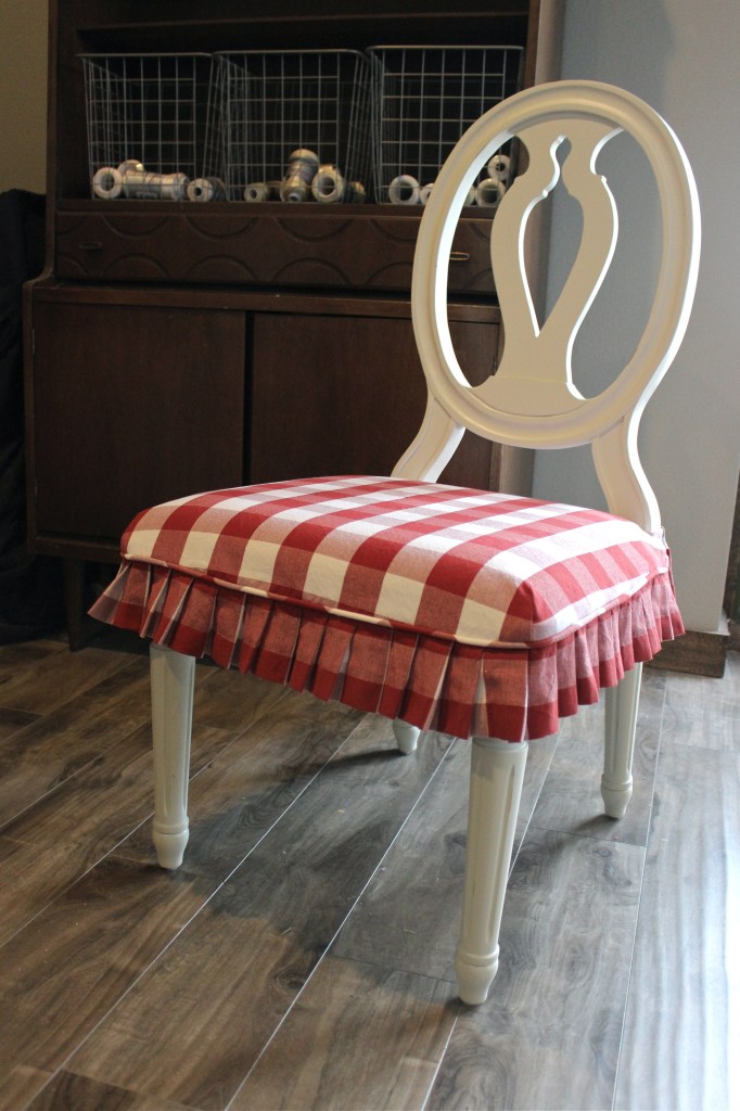
Shelley at Slipcovers by Shelley made this very cute red buffalo check seat cover. The small scale pattern is perfect for the proportion of the chair.
Did you notice the little skirt? She made each pleat width the same size as one check width. I love how that created a band of almost solid color all the way around the chair. Smart design!
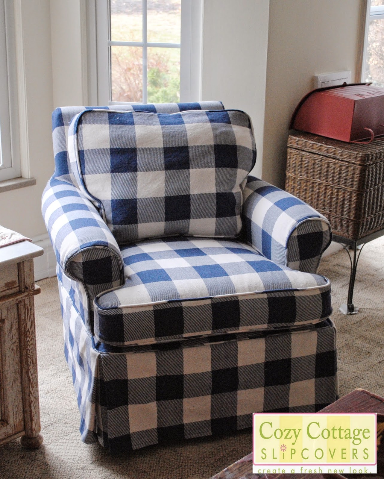
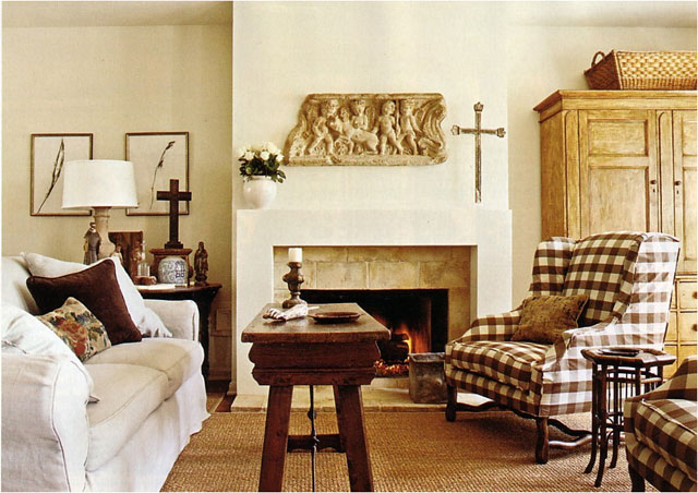
Talk about choosing the right size check for the job! This beautiful blue and white cover was made by Teresa at Cozy Cottage Slipcovers. The large-scale pattern is absolutely spot on for the chair’s boxy shape. And it’s centered, balanced and matched. So nice!
I hope these few tips inspire you to slipcover with a buffalo check!
Wow, that is quite a transformation from the floral to the check. Beautiful work!!
Thanks, Julie. I think that piece is Chippendale, possibly 30 years old. Still solid and comfy as can be. Just needed a new look.
Any suggestions of where to find a black and white buffalo check fabric that has larger checks? And one that is affordable?
Hi Jody, I don’t have a particular resource but there are many online fabric stores that sell large scale B & W buffalo checks under $10 /yard. Expect them to be light to medium weight prints, not woven. I would dive into a Google search. I think you’ll find something that will work for your project.